Projects
Mapping COVID-19 in Montreal
I made these two maps in spring 2021 for the Trottier Family Foundation. The purpose of the maps was to inform policy discussions, especially the placement of vaccine sites and vaccine equity.
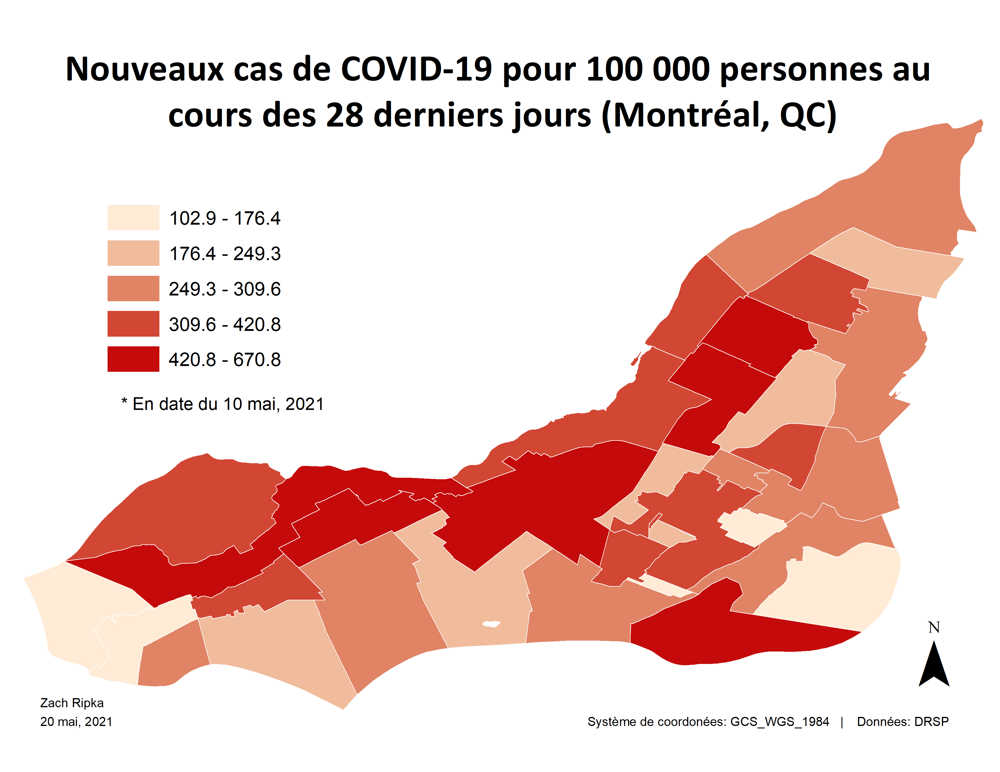 This map shows, at the neighbourhood level, the number of new COVID-19 cases per 100 000 people for the 4-week period leading up to May 10th, 2021.
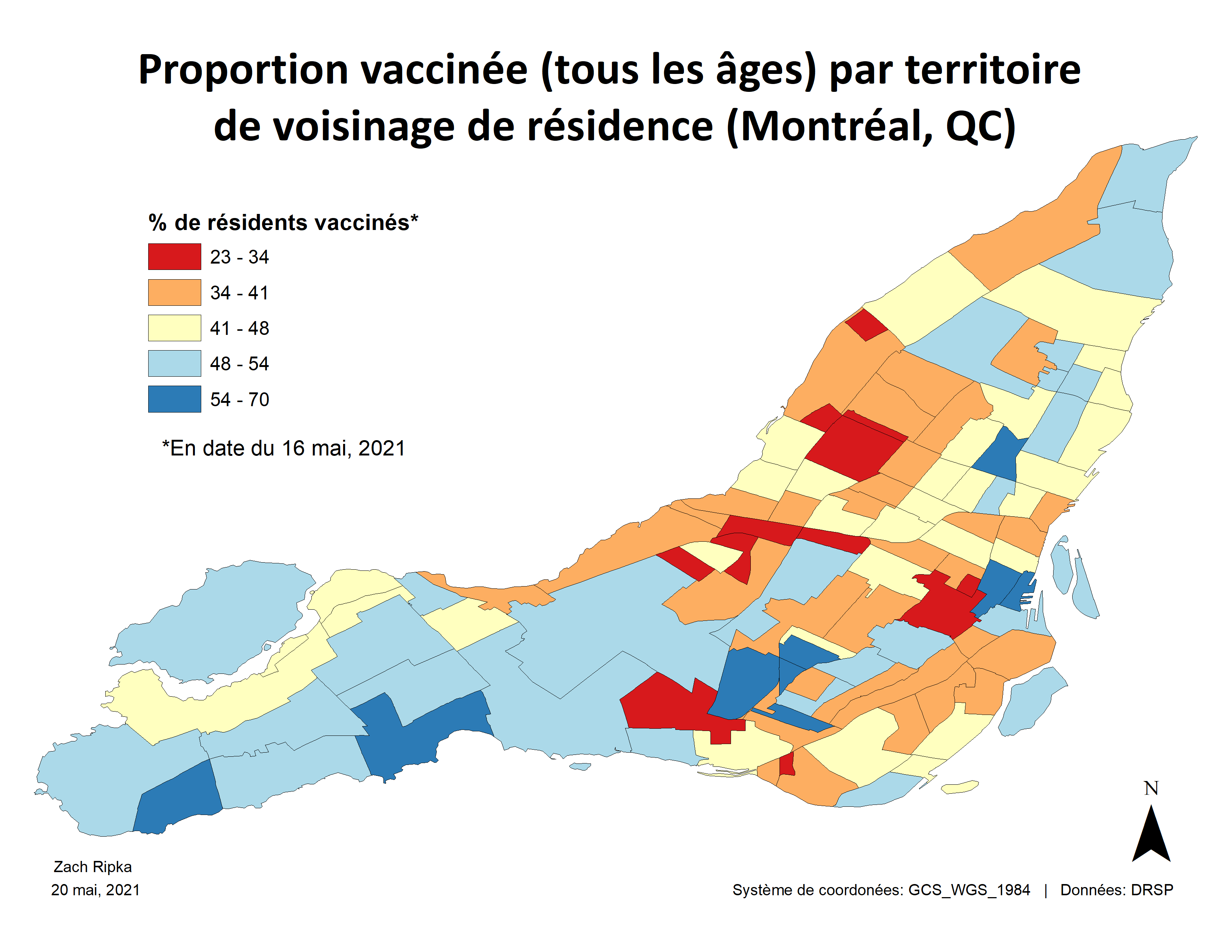 This map shows the percentage fully vaccinated residents, current to May 16th, 2021. The geographic unit is smaller than a neighbourhood, called the “territoire de voisinage de residence” and defined by Montreal public health (DRSP). It translates roughly to “neighbourhood residence zone.”
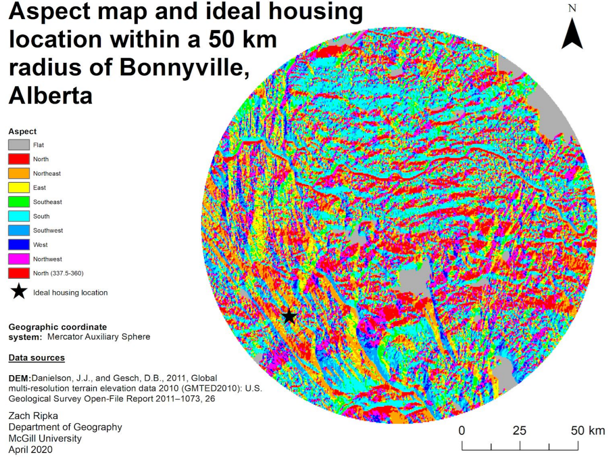
Optimizing housing placement
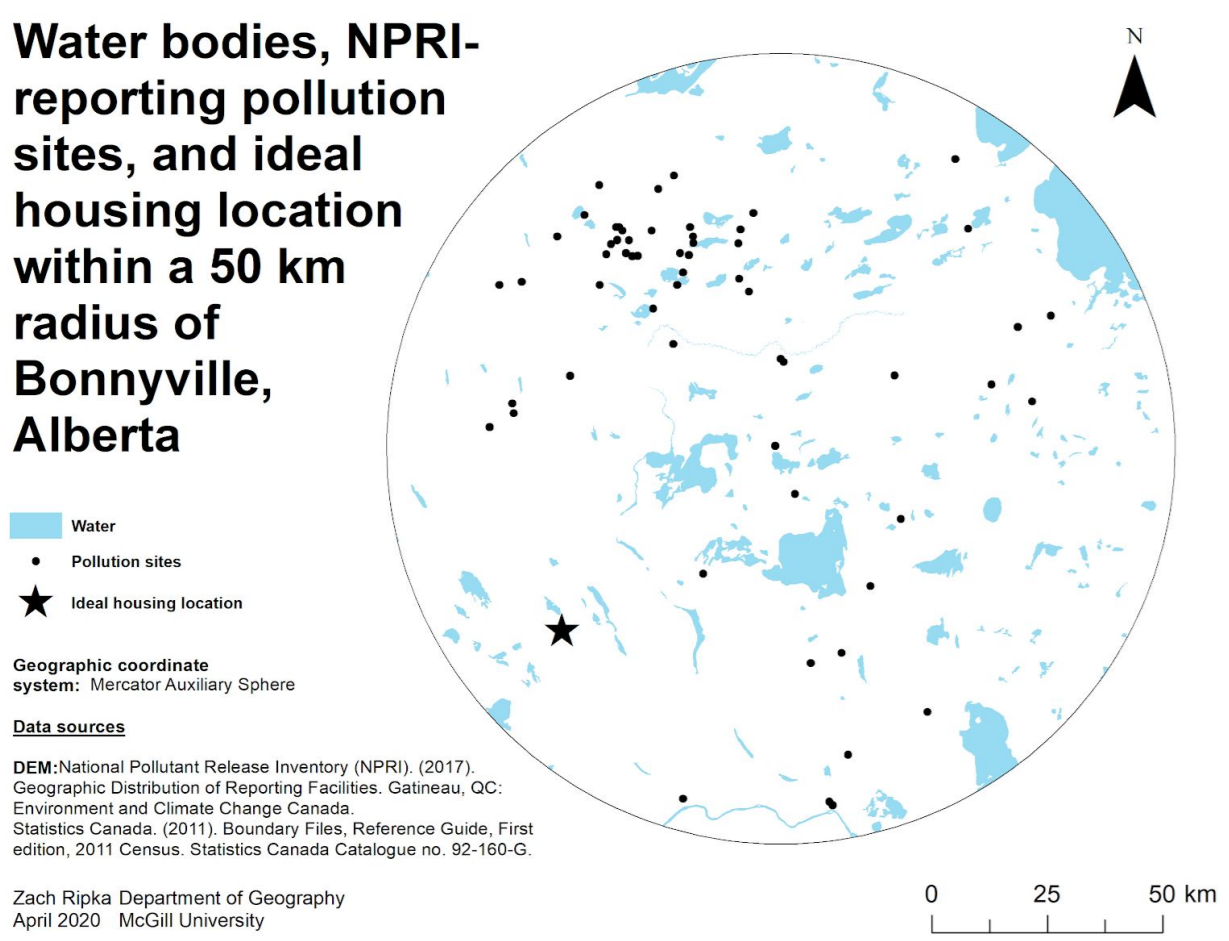
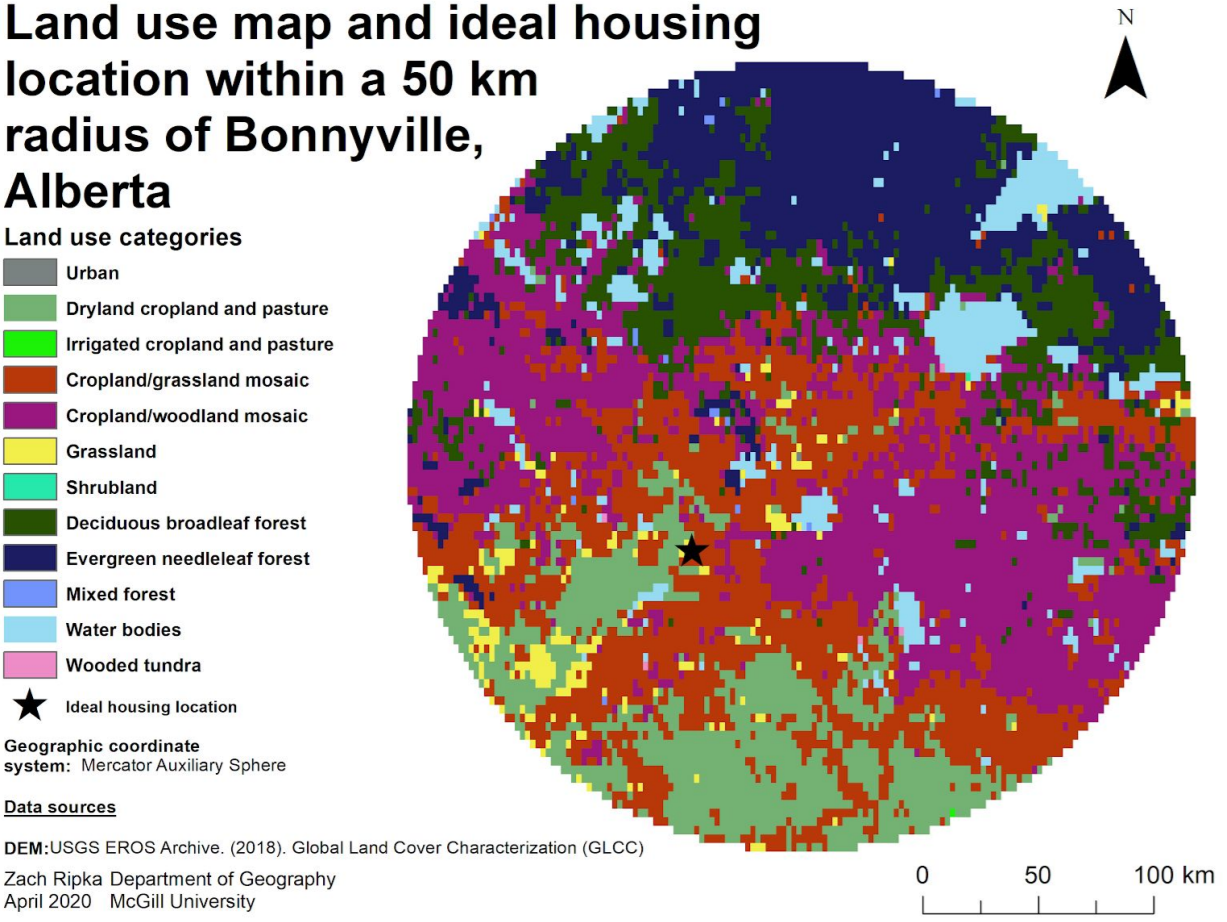
I produced this report for a class while I was in school. We took several layers of geographic data, each one representing a factor that would influence how suitable a site would be to build a house.
I chose to find a location with lots of space (low population density), proximity to natural areas, low flood risk, and south-facing aspect for good gardening conditions. I also included clean air and water, and so I included distance from NPRI-reporting pollution sites as a factor.
To find the best place to build a house based on my criteria, I normalized all of the factors to a comparable scale, created a simple weighting scheme, and ran the calculation in ArcGIS. My result is marked by the star symbol in the maps below.
COVID-19 and poverty
Without a doubt, the risk of contracting COVID-19 throughout the pandemic is associated with poverty. When I was a research assistant in the Geo-social Determinants of Health Research Group at McGill University, my colleagues and I worked to effectively visualize the relationship between income and infection rates.
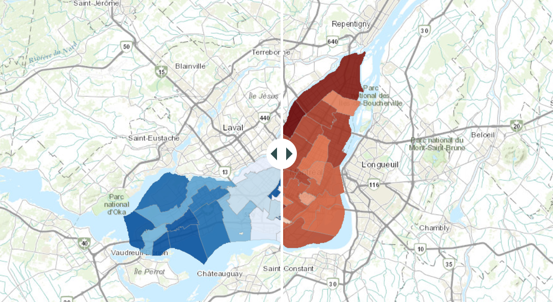
The darker the blue colour, the higher the neighbourhood’s median income. The darker the red colour, the higher the COVID-19 infection rate. Dragging the toggle back and forth allows for easy comparison of the two variables, and shows a clear relationship: dark blue neighbourhoods tend to be light red, and vice versa, visually revealing the inverse relationship between income and COVID-19 infection rates.